#what I like most about my own sprite is the posing
Explore tagged Tumblr posts
Note
i should respond with my own tierlist we can have a heated discussion over this /silly @textbook-dinner
1. Kire
oogaa booga i like woman. hoobie boobie pretty lady aughh. did you SERIOUSLY think I'd have a good reasoning for this.
In all seriousness: I like this design for its uniqueness and also for the very strong and unmistakeable aesthetic it presents. you won't find many other vocal synths that are decked out in such elegant formal wear like this. Kire's design also has some elements of old ball gowns which I like. Ritsu's main designs in general have a lot of historical influence which we're going to see with the next one as well. part of the reason I ranked kire higher is not only because she's pretty but also because ritsu kire has had a lot of cultural influence (thanks kyaami), and I think that's really special
2. Normal/DeepVocal
It's the same design. I will swear on this. You will not take the deepvocal artwork from my cold bony hands. The deepvocal artwork has a few different texture choices from the one that CAFFEIN drew, but I don't think either one is better or worse than the other. Shiny is fun, and so is the more modest matte approach.
Ritsu's normal design has a wonderful color palette and gives him such a unique silhouette that you could recognize him a mile away. Of course that's mostly thanks to the skirt. I really enjoy how the dress is purple, his eyes are green, and his hair is orange. It makes a nice triad. I love putting Ritsu in purple garments for this reason.
I like how the outfit seems to draw from lolita fashion, even if very loosely. Those shoes are so vintage too what the hell. Slay queen. The layered-cake shape of the skirt is extremely unique and I've been enamored with it ever since I first saw it. Funnily enough though, the skirt is also what drags this design down. It's very hard to imagine how it interacts with things around it. How it looks from different angles. Hell, every single 3D model of this idiot with that skirt looks SO FUCKING GOOFY. I just can't take it seriously. As iconic as this design is, its biggest strength is simultaneously its downfall, putting it just below kire (they're very close though)
2.5. Voicevox(?) (bonus)
have you ever seen this image. its from one of Ritsu's official artists. i think that top is the cutest thing. I cant believe ritsu got a degree im so proud of her (artwork by kiku no ji)

3. Strong
He's cute. Nothing remarkable, but sometimes you just need a simple design. I don't have anything in particular to say about this one. I like the departure from the very elegant style of the first design (normal) to something more preppy, whilst still feeling like the same guy. I like CAFFEIN's designs more than what's to come in the future...
4. Uruha
Okay I'm actually wholly biased when it comes to the placement of this one. Once again there's nothing remarkable about him. He's a little ugly. But i have very silly headcanons for him so I unfortunately have gotten a little attached. I really like the short hair for some reason. He's like gachapoid to me. next entry
5. Mabayu
little shit
6. Eve
Really nothing special. Everything from this point forward stops feeling like Ritsu altogether (ignoring that I just put the little rats higher than eve. don't get it twisted, they're not Ritsu to me either). CAFFEIN captured such a unique fashion sense for this character and they just threw it out. They lost it like the poodle stuffie I left on the bus when I was 4 (still not over it). This doesn't seem like something Ritsu would wear. This feels like Ritsu's weird aunt she never knew existed until she started getting strange emails claiming that her family is looking for her. She's forgettable. But at least the outfit isn't generic.... yet.
7. Ace
Not Ritsu. What is this. I know my wife when I see her.
This design, in a vacuum, is nothing bad. But my god they missed the mark entirely. This is just a whole different character. I can't explain to you how. You really just have to see it yourself.
8. That blue dwarf Kanon put on her website recently
As interested as I am to see what these sprites are going to be used for, this design is just so embarrassing. It shares a few similarities with Ruko fem, who pulled off the look a lot better. That gray muddied blue and mustard-yellow combo makes me cry. It doesn't suit him at all. The whole outfit feels extremely generic, like I could put it on any character and it would still work. Ace may have felt like a whole different character, but this feels like the same character but stripped of all their charm. One of the first things I said about this design is that they made him look like... a normal girl. They took his autism. They took his gender. They took his bisexuality. He's a shell of who he once was. God save him.
ranking ritsu's vb designs /lh
1. Normal
The only ritsu design, everyone else can leave. ok kire you can stay but youre on thin ice
2. Kire
I keep forgetting where his body ends and his veil begins, and so from a distance he just looks like a inky blob
3. Ace
This is like if a iced bicuit were nonbinary. No seriously, i can taste this image
4. Mabayu
The only reason i voted this higher than eve is because he has one of the only variations in hairstyle apart from uruha :sob:
5. The VVV Live Design (bonus entry)
It's giving teto synthv from wish, but it's still better than some of the other designs on this list
6. Eve
The colours are so garish that the only reason i remember this design exists is because my school has a poster with the periodic table of the elements as manga characters, and the girl from iridum looks like eve
6. Strong
I'm 99% sure that caffein made this design so that he could have an excuse to draw ritsu boobs, but his body up from the waist is built like a lego figure and i just can't get past that. (ritsu's, not caffein's)
7.Uruha
This is the only ritsu design i could realistically cosplay, since dresses are the bane of my existence, but then again, i don't want to look like a gothic leprechaun if i can help it
8. Deepvocal
Maybe it's because its the png always used on those stupid ass memes, but i genuinely have beef with this design. he looks like he would describe himself as being an "alpha sigma rizzler with the level 5 gyatt and the baby gronk mewing aura". and that's not even starting on his abs.....
9. Eve 2 or whatever this design is supposed to be
What. what is this. i genuinely thought that this design was a relic of the past from the eve design competition in 2014, and i kind of wish it still was. this flopped so hard omfg. blue does not suit him at all😭
i disagree with most of your opinions but oH MY G OD IM SO GLAD PEOPLE HATE THE BLUE ONE AS MUCH AS I DO LMAOAOAOAO
in THEORY the blue should work because it's a contrasting color to orange which is a major color in his design. but for some reason it just. doesn't. i can't see him wearing anything in that color
#Ritsu#Laurtalks#i have some very strong opinions if you couldnt tell#this is all in good fun though#I like talking about character design#and I also like talking about opinions#:)#should have added my ritsu nanika design to the tier list /silly#oh well#it would be lower on the list anyway#I think I could have done better#what I like most about my own sprite is the posing#lots of movement. aggressive expression. yeaaaaaaaah#long post#sorry going back to your list because i just had a thought#“excuse to draw ritsu's boobs” have you SEEN my design#I'm even more shameful than caffein is#and I'd do it again
25 notes
·
View notes
Note
Hi! I have a question about Diasomnia's signature wands/batons. I was wondering if it was ever stated why they don't use magic pens like the majority of the other students. Especially Silver: did they ever say why he uses almost exclusively the baton? Sebek and Lilia at least use magic pens in their school uniforms (also gym and lab uni, I think), but Silver only uses it in his ceremonial robes (at least for his base cards)


There is currently no official explanation as to why Diasomnia is the only dorm with a unique variant of the magical pen (by way of their batons). Note that not just Silver, Sebek, and Lilia use them, but so do all the mob students if you take a look at their belts:


Lilia’s baton is not visible in his full-body Dorm Uniform model, but we see him wielding it in the initial artwork of his Dorm Uniform SSR.


Similarly, both Dorm Uniform Sebek and Dorm Uniform Silver are shown with their batons in the initial arts and their Groovies. Together, their poses imply the capability to both attack and defend with this particular model of magical "pen" (baton).


My best guess is that Diasomnia gets batons because they are the magical “all-rounders” at NRC. They’re special and therefore get a design that no one else does. It’s similar to how students in certain programs or of certain statuses like honors (in this case, dorm) get exclusive perks that other students may not. This seems to be just a cosmetic change though, not a significant power boost or something of the like.
You could also say maybe the baton design is to go with the theming of the dorm being bodyguards—but if that’s the case, then how come none of the other dorms, who also have their own themes, get their own designs?
As for why Silver appears most frequently with a baton instead of a magical pen, there doesn’t seem to be a clear explanation given for that either. (I did go back and check permanent pool cards; all Sebek and Lilia cards besides their Dorm Uniform use the magical pen; they only use batons in their Dorm Uniforms. Silver, however, only uses his magical pen in his Ceremonial Robes; all other times he uses the baton.)
At first, I thought maybe it had something to do with the vignettes—like maybe he uses the baton on the associated stories? But that wasn’t the case. He isn’t even using magic in a lot of them, so there wasn’t a correlation there. In the Ceremonial Robes vignettes (the chibi model with the magical pen), he even whips out the baton (which freaks Idia out), not the pen. This results in a mismatch between what is shown in the vignettes and what the chibi sprite shows. So really, I don’t think there is a special meaning since the gameplay elements (the chibi sprites + cards) don’t always match well with the stories that come with them.
Maybe if we push it, Silver is just most prominently associated with the baton because he is the most “knightly” one of the group? He is also depicted receiving a new baton from his father in his Birthday Boy Groovy, so the connection has been strong since the earlier days of TWST.

#twisted wonderland#twst#Lilia Vanrouge#Sebek Zigvolt#Silver#disney twisted wonderland#disney twst#notes from the writing raven#question#twst theory#twst theories#twisted wonderland theory#twisted wonderland theories#Idia Shroud#Silver ceremonial robes vignette spoilers
135 notes
·
View notes
Text
Soooo…
Bill Cipher in Twisted Wonderland.
It’s probably Ace and Deuce’s fault (it’s always Ace and Deuce’s fault.) and when Bill is summoned, he is HORRIFIED to see that it’s in a human body. Cos ew human body gross. It’s also a tumblr sexyman twink body cos that’s the rules Twst plays by. He’s also aware of his limited range of motion. (“How come I can only make five poses and facial expressions????”)
So Bill sets off to find someone to make a deal with so he can get his real form back and find a way out of this world.
However, not a single one of these teenagers is interested in making a deal.
Most of them don’t trust him (Leona, Jamil, etc.)
Some prefer to do the hard work (Vil)
Some abide by the rules too hard (“The rules of the Queen of Hearts state that any handshake deals may only be performed in the presence of a licensed amphibian!”)
And while some come close (Ruggie, Kalim) they have other folks to talk them out of it.
There’s even a few who won’t even talk to him (Idia)
And some are too goody-goody for Bill to even bother with (Silver, Jack)
And Rook just creeps him out.
Eventually, Bill comes across Grimm, and offers him a deal to make him a great mage, which Grimm almost jumps on, but realizes he might lose his minion (us) so he asks what we think.
>You should go for it Grimm!
>Seems fishy…
“Who are you talking to?”
Because the MC has no sprite, Bill doesn’t see them…
But he sees US.
“Ohhh! I see! This is some kinda mobile game! Probably approved by the mouse huh?”
And he taps on the screen which makes the sparkles when you tap on the screen in Twst appear.
“How INTERESTING. Now that I know you’re there, if you tap the screen at all, I can shake your hand and get outa here!”
If you have autoplay on, he reaches up and turns it off.
“Looks like it’s just you and me, pal! And I’ve got an eternity!”
Thankfully the game keeps moving and the students and Crowly show up to warn us about Bill.
Bill finds this amusing and treats us to an unwinnable fight.
Bill, now in his red form, taunts us some more…
And then we get the flashbacks. Like how the MC gets Disney Movie flashbacks at the beginning of each book.
“Names Bill Cipher!”
“Hiya smart guy!”
“I know lots of things! Lots of things.”
“WELCOME ONE AND ALL!! TO WIERDMAGEDDON!!!!”
“I have some children I need to make into corpses!!”
And then…
“Do a pretty good impression of my brother, don’t I? Switch clothes and no one can tell us apart!”
“You’re a real wise guy, but you made one fatal mistake: YOU MESSED WITH MY FAMILY!”
“No you’re making a mistake!!! I’ll give you anything! Money! Fame! Infinite riches! Your own galaxy! PLEASE!!! WHATS HAPPENING TO ME???”
“STANLEYYYYYYY!!!!”
>Left Hook
Whack!
Bill turns yellow, everyone is shocked.
“Did Yuu just… punch him??”
Luckily, this has bought enough time for some kind of agents (probably from the theraprism) to show up and take Bill away, kicking and screaming.
That night, the MC has a dream (?) where they talk to triangle Bill through the mirror they usually talk to Mickey in.
Bill “thanks” them for getting him arrested AGAIN. But since he’s on our mind, he gives us something to remember him by (and totally not a conduit to come back from/see through):
An SR card for twisted Bill Cipher.
With a promise:
We’ll meet again~!
31 notes
·
View notes
Note
What are your all-time favorite outfits from Twisted Wonderland?
Hello @letterstoear, thank you for ask! I've had a lot of fun making this post, and I'm so sorry that it took forever to answer!
Every time I was certain I had my list narrowed down, I remembered another outfit I really liked. (Also, I'm a little bit biased, as you will see...haha). This time, I focused on event outfits to make it easier for myself. Maybe in the future I'll post my "reviews" on dorm uniforms or Halloween costumes.
I am always blown away by the the little details that Yana Toboso and the rest of the design team have added to each of characters' outfits, because they give some interesting insight to their personalities and backgrounds.
Without further ado, let's discuss some outfits! (Please note that there are spoilers for upcoming events from the JP server, as well as some groovy arts!)
My Favorite Twisted Wonderland Outfits
10. Floyd's Outdoor Wear (Vargas Camp)
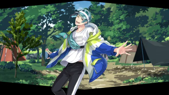
Most of the outfits on my list are on the extravagant side. I recently bought a volume of Black Butler, where there was a note about how Yana Toboso loves to draw clothing, and it truly shows.
But in contrast to seeing our beloved characters in over-the-top costumes, it's refreshing to see them wearing casual outfits once in a while as well and see their individual, everyday styles.
I'll admit that I haven't played any of the Vargas Camp events, and have a grand total of zero (0) cards from this series. I'm not sure why; I always miss the event's runtime for some reason.
Still, I've always loved Floyd's little sling bag with the eel keychain, as well as the teal visor. The bright colors stand out and are appealing.
The whole outfit looks like something you could get from a store like Uniqlo, and sometimes it is nice to have that sort of realism in a magical game. He looks like an ordinary teenager I could find on the street. Except...if I did find Floyd on the street, I'd be running in the other direction. But that's not the main idea here.
9. Azul's Glorious Masquerade Outfit
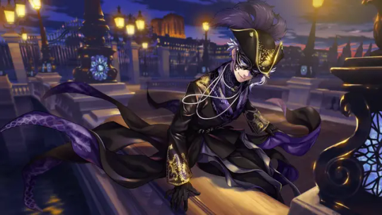
At first, I sort of forgot that this SSR existed. When the PV for Glorious Masquerade came out, I was more focused on Malleus.
However, eventually, many people began to cosplay as GloMas Azul, and they all looked so amazing. I began to appreciate the outfit more after seeing people pose and dance in it. Azul also tends to have some of the best fanart, and fans have spared no expense when drawing him wearing this.
My favorite part of the outfit is his coat. I like the silhouette it creates with a high-waist belt, and the long coattails that resemble tentacles. The ruffles on his trousers are cute, too. I would buy a pair if I could. Unfortunately, it's hard to see these details on his in-game sprite.
As for his accessories, the pearls are so dramatic (and so very Azul). His round glasses are also cute, I hope he wears them again!
8. Idia's Suitor Suit
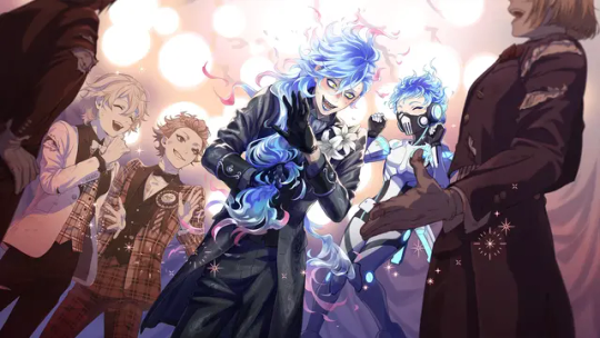
One look at Idia's Ghost Marriage outfit, and you can really tell that it was designed by Yana Toboso. His gloves, coat, and cravat make him look like he's in the Victorian Era. Also, doesn't he look sort of like Grelle from Black Butler?
Speaking of Grelle, Idia's outfit is meant to look more like funeral attire, between the long, black coat and the lilies pinned to his shoulder. There are also skulls hidden throughout his outfit, such as on his jacket chain and cufflinks. I was still new to TWST at the time, so I just thought that Idia liked gothic clothing. I didn't realize he was (at least in his mind) attending his own funeral!
Let's not forget his new hairstyle! This is one of Idia's first SSRs if I remember correctly, so it was exciting to see him with a ponytail.
My love for this outfit also comes from my love for the story associated with it. Fans have pointed out that Idia's "arranged marriage" with Eliza parallels the myth of Hades and Persephone. The design team and Yana were so clever for this.
I don't have this card, either, but I hope to pick him up one day!
7. Ortho's Fairy Gear
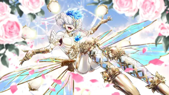
The Shroud brothers are luckyーthey are probably two of the characters with the most SSRs in the game.
That being said, we all have to agree that Ortho's fairy gear is one of the most unique and avant-garde cards in the game.
I really enjoy the white and gold color scheme in this event. His color-changing wings are stunning, and the piece covering his eyes makes him look very mysterious.
I thought this card was cool when I first saw it, but then I learned that Ortho's outfit and hair can turn pink, which is even better.
Every time I see his "pointe shoes," it makes me imagine Ortho and Idia trying to learn how to dance together in Idia's room, and Idia obsessively studying ballet costumes for his younger brother.
Yet again, I don't have this card, but my best friend does! At least I can admire him from her phone...
6. Silver's Rabbit Wear
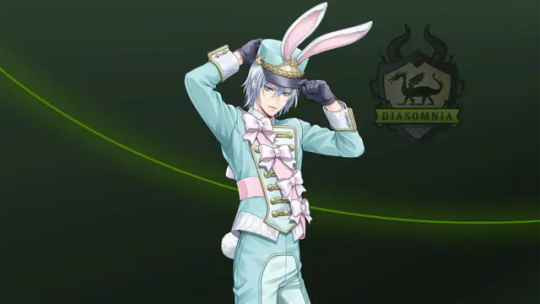
There is no way that this outfit is just an R card! When this card was first advertised in one of the JR rail train stations, the pictures showed this card with Deuce's hometown in the background instead of the standard Diasomnia R background, so I thought that this card would at least be an SR. (Although I can't complain so much, because that means it's free!)
Silver is so princely. I am convinced that he can look good in anything. I am fond of pastel colors, and the pink/blue color scheme suits him, as the TWST version of Aurora. The bows may be silly, but I find them adorable.
Compared to the other boys in this event, Silver's outfit looks a little more like a soldier's (albeit a toy soldier's or a nutcracker's), which is a cool touch.
5. Deuce's Rabbit Wear
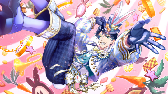
Deuce's hometown event was truly one of my favorite events that came out in the JP sever last year. Not only were some of my most favorite characters there, but they were dressed up in the most whimsical outfits possible. (And we got to meet Deuce's motherーshe's the coolest!)
Since Deuce is the main character of this event, his outfit bears the most resemblance to the white rabbit's in most classic illustrations, complete with a bow tie, top hat, and, of course, his pocket watch. His outfit has a blue color scheme. Like Azul in GloMas, Deuce also wears round glasses in his groovy art. Overall, it looks like the sweet ouji style, although I'm not very familiar with this sub-fashion. If anyone who is reading this has studied/worn this style of fashion, please let me know!
I used to play Love Nikki and Shining Nikki (two fashion-themed gacha games), which also featured lolita dresses inspired by Alice in Wonderland characters. For this reason, Deuce's outfit in particular feels very nostalgic to me.
4. Lilia's Right General Armor
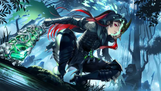
Here's another departure from the cute pastel outfits...
Sleeping Beauty was one of my favorite Disney movies as a child. I always remembered Maleficent's "goons" as short, silly little creatures wearing simple green tunics.
So how on earth did we get to Right General Lilia Vanrouge?!
Seriously, I'm just stunned by how the artists looked at the source material and created something so radically, yet wonderfully, different.
I'm curious about the green stones (jades?) on his outfit--around his waist, there are several pieces attached to tassels, and he has two strapped to his right leg. The material matches the stone used for his weapon. Maybe it represents his status in Briar Valley. If you check his (unposed) sprite, you can also see that he is wearing something around his waist that looks like folded bat wings.
Like everyone else, I'm obsessed with his long hairーit makes him look so formidable, especially with that hood. My friends and I like to joke that his ponytail makes him look like a character in a Chinese martial arts drama.
Again, the story associated with this card made me love it even more. Few books have made me cry as much as Book 7 of TWST.
3. Malleus' Glorious Masquerade Outfit
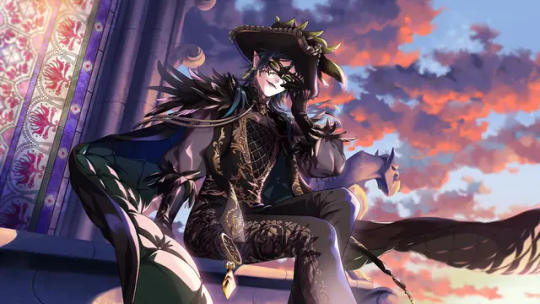
While Sleeping Beauty was my favorite movie as a young child, when I got older, I began to love The Hunchback of Notre Dame. It was only natural for this outfit to be among my favorites for this reason.
There are so many details here. The feathered hat. The sheer sleeves. The golden embroidery. The split cape. It's honestly overwhelming to take in at once.
I can say that my favorite detail is his green earrings. They really bring out his eye color, and the PV made them so sparkly.
In addition, everyone I've ever seen who has cosplayed as GloMas Malleus or has drawn fanart of him has increased my appreciation of this outfit.
[Now for some very spoiler-y stuff] The fact that this event came just before the release of Chapter 7 is worth noting. Doesn't it feel a bit tragic that just before Malleus' overblot, we have a chance to see him wearing an outfit that makes him look especially like his mother, having fun and being the star at the masquerade? And what about the feathers on his shouldersーdo they hint at another side of his family? There's so much foreshadowing and mystery going on, and nothing is more suitable for the occasion than masquerade attire.
2. Kalim's New Year Attire
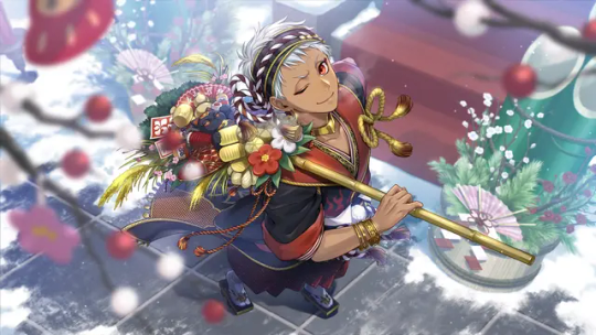
I've already rambled about how sentimental this outfit is to me in a previous post, but in summary: New Year is my favorite holiday, and the New Year's Sale event was the first event I "seriously" participated in. Kalim looks excessively cute and festive in his kimono, and every time I see this card, I feel nostalgic and in the holiday mood.
1. (Tied) Epel's Applepom Outfit and Riddle's Beach Outfit
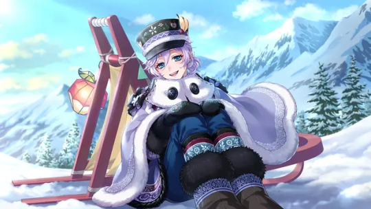
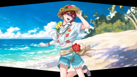
I'm really sorry, Epel and Riddle are my favorite characters, and in the end, I refuse to chose between them. They're like my younger brothers! I try to collect all of their cards, so I pay attention to their outfits the most, and picking only one outfit for each character was a challenge in itself.
My favorite part of Epel's Applepom outfit is his cloak. It looks so fluffy and warm. When you set him as your home screen character, you also have the option to "swap looks" and see his outfit without the cloak--the apple embroidery on the rest of his outfit is very detailed. Many fans have mentioned that the outfits people wear in Harveston resemble traditional Scandinavian clothing, which is really cool!
The little apple slices on his cap are everything.
And I'm always happy to see characters in different hairstyles, such as Epel's little ponytail.
One of my headcanons is that you're allowed to call Epel cute, but only when he wears this specific outfit, because he takes it as a complement to his culture.
As for Riddle, we're all so used to seeing him wearing formal suits. It's so nice to see him loosening up for once. He looks so happy, now that he has the chance to see the ocean for the first time!
I also happened to be on vacation at the beach around the time this event came out, so it felt like a gift.
I have to laugh a little, because there are so many flowers on his outfit. Even Jack pointed it out in the story. But he looks so cute!
I suppose we have to discuss the elephant in the room. My friend saw it before me, so she spammed me with messages along the lines of "RIDDLE IS WEARING A CROP TOP!!! THIS IS NOT A DRILL!!!" and I naturally thought she was pranking me. But lo and behold, it's the truth. I like to headcanon that among the rest of the cast in this event, everyone has made an unspoken mutual agreement not to mention it. This Victorian child has already been through enough, and not a word must reach Mrs. Rosehearts.
Thank you once again for the ask! For anyone who read all of this, what do you think about these outfits, and which ones in the game are your favorite?
#The words “short” and “brief” are not in my vocabulary apparently#But it's alright#I just really love the work and details that the artists have put into the game#As well as the fan content! I'm so happy I joined the TWST fandom at this time#disney twisted wonderland#twst#twisted wonderland#floyd leech#azul ashengrotto#idia shroud#ortho shroud#twst silver#silver vanrouge#deuce spade#lilia vanrouge#malleus draconia#kalim al asim#epel felmier#riddle rosehearts
56 notes
·
View notes
Note
Hello hello, I love your work and was wondering if you'd be open to making a little breakdown of your art style?
It's really interesting to me and I love taking bits of different artists art style elements and incorporating them into my doodles to get better
Totally okay if you don't want to! 💜💜💜
Take care and have an amazing life 🤗💜☺️
Hello!! Thanks for asking 🤗 I'm not making a little breakdown of my art style I already WROTE A WHOLE ESSAY ABOUT IT!!
Sorry I exaggerated it a bit🥲🥲...
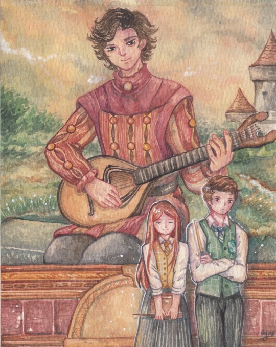
I was very happy to receive this ask, but at the same time I felt worried. Honestly, I didn’t know how to give you a relevant answer because I don’t even think I have a consistent art style 🥲. Except for my usual chibi style which I feel most comfortable with, I feel my style constantly changes. So after going back to review my old paintings, I think my style is a combination of children's book illustrations and Japanese anime style. Many times I have received comments about my paintings looking like they are from children's books, and I agree haha, maybe because I mostly draw small characters in big settings and I usually use bright colors.
My favorite artists:
My drawing style is mostly influenced by my all time favorite artists Heikala and Koyamori, I stumbled across their Insta accounts during my 1st year in college (that was 10 years ago) and from then my drawing style gradually took shape. I also admire Paulina Cassidy, mostly because I like her whimsical nature sprites theme. Recently I’ve been investing in Stephanie Law’s artwork, her coloring technique is so god-like that I hope one day I can reach that level…
Ideas and Inspirations:
Japanese anime/manga culture has had a great impact on my childhood. It was a dream come true for me to be able to pursue my college study in Japan. I think this journey greatly affected my current style. I draw lots of things from small doodles to funny comics. I'd describe my drawings as “silly and cute” since I love to make people laugh and I also live for the fluffs (Sometimes I drew angst too but it still turned out cute haha..). Aside from that, I prefer making “storytelling” illustrations with colorful backgrounds. My favorite things to draw are tiny characters in big scenery, I like to create peaceful static moments that when looking at them help warm my heart and calm my mind.

When making game fanarts, I usually take screenshots as references for background and imagine how the character will act in that setting. I just do what I feel comfortable and use my own judgment for composition … which… sometimes results in weird perspectives (and you know what I’ve just discovered the rule of third recently 😅…).

Characters:
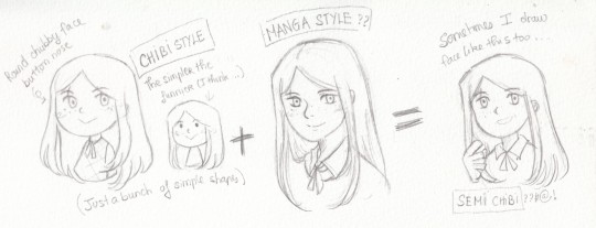
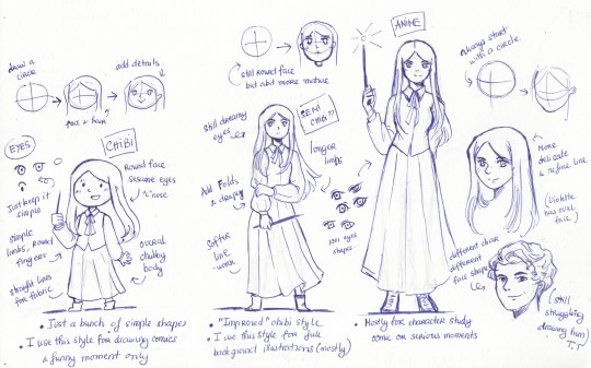
When it comes to drawing characters, I honestly don't know how to explain my style. I think chibi is my most recognizable style, apart from that I usually draw characters in semi-chibi (is it the right way to call it??) or simple anime style. I don’t usually draw characters with dynamic poses or movements ( that’s why I still suck at anatomy and expression 😩😩). I think I’m shifting from anime to a more cartoon style since I kinda have same face problem and I’m trying to practice face shapes.
I think my character drawing style is most influenced by Akihiko Yoshida (who is behind many FF/Nier/ bravely default concepts), as I always draw my characters with chubby round faces and dreamy eyes. I made an example of how I usually draw my characters below.


Technique:
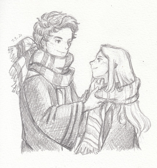
Watercolor technique is quite complex so I’ll explain how I always do my paintings in another sharing post. I’ve posted part 1 of my sharing here. Generally, I love using bright, saturated tones and black ink brush pen or color brush to paint line work.
. I hope I could answer your question. I’m definitely no expert, all the things about art I've learn was self-taught but I'm happy to help anyway I can. 💕💕
And you 🫵🫵 yes you dear sweet anon! I wish you a happy life too!!!! 💕💕
#ama#please excuse my English and that messy handwriting#hope this one is helpful to you#sharings#my art#hogwarts legacy#hogwarts legacy mc#hogwarts legacy oc
22 notes
·
View notes
Text
so ever since i saw undertale yellows merciless route, ive been having a thought about it:
which is also helped by me having had a big interest in undertale aus back in the day dfhjkg
UNDERTALE YELLOW MERCILESS SPOILERS UNDER THE CUT
what would happen afterward in that timeline? what happens to the underground after asgore is killed, and theyre shot back to square one?
what would happen if frisk still fell down in that timeline?
so if youll excuse my still-practicing pixel art (i did end up grabbing the hat and pistol off a clover spritesheet on spriters resource though, and the pose and poncho were built off a couple kris sprites), a small sprite edit, and a maybe-meh teen clover design:
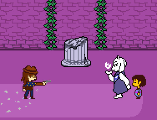
for right now im calling this Vengeance AU for a lack of a better name that wouldnt just be [blank]tale or under[blank], with or without a "yellow" attached
also i made clover a teen just to set this version of them apart, plus a blue, starry poncho instead of their usual bandana, and spurs on their boots
(IF ANYONE PICKS THIS AU UP FOR ANTHING, CLOVER AND FRISK (and chara, if included) USE THEY/THEM PRONOUNS!!)
an au where after the events of yellows merciless run, frisk still falls down mt ebott, whether because of clover, or their own reason,
but clover, who once made the climb themself to get vengeance for the other 5 fallen humans, isnt about to let yet another go missing under their watch, and decides to chase after them, and bring them back home. by force, if necessary.
so it ends up with frisks journey through the underground being constantly chased by clover. and while clover doesnt want to intentionally hurt frisk, since their motivation is the "protection" of humankind, it would still no doubt be terrifying for frisk, and clover WILL hurt the monsters.
ruins end up being mostly the same, minus clovers pursuit. toriel, still locked in the ruins, probably wouldnt have heard about asgores death, and would only realize upon seeing clover, grown up, covered in dust, and detached from the world around them.
outside though, things would take a much more bleak turn.
the royal guard is more present after a surge of recruitment, monsters have mostly accepted that theyre stuck down there for eternity, some making the most of it and trying to live happily, others not so much. and when it comes to humans, monsterkind is just a little more on-edge.
papyrus also ends up being recruited, however hes only a lookout/watchman, and not a fully-fledged guardsman, due to undynes biases. she WOULD have preferred he wasnt hired at all, but the guard was desperate, and didnt have many other volunteers
also due to hotlands evacuation at the time, martlets final stand is mostly forgotten, only seen as a rumor with little ground. the only thing people know of is that there was a strange withered flower on the roof of the apartments, but no one thinks anything of it. there is, however, still a lingering resentment in the air around it that makes monsters uneasy, but also weirdly enough, like theres someone watching over all of them
other than that, im not too sure where this au would go, how frisk would end up dealing with clover by the end, or even if frisk would end up in places like the dunes or steamworks, or if theyd stick to roughly the same areas.
i mostly just thought itd be interesting to start to imagine how different things would be, and considering clovers personality and motivations in merciless, i thought itd be interesting if they became an antagonist, following frisk down to drag them back
i might think more on this and add stuff onto it in the future, but for right now this is all there is, but people are free to build on it in their own ways, if they like!! (and/or send an ask and i can TRY to think of an answer, but knowing myself i cant promise anything)
#undertale yellow#undertale yellow spoilers#clover uty#ellesprites#elle rambles#vengeance au#undertale#undertale au#frisk
58 notes
·
View notes
Text
Meet the Team - Pseu
You can also find @picksleydust on: Twitter @ pseuboo
Ahoy friends, from the Land Down Under. I’m a fandom artist who spends my days as a barista and painter and nights hunched over my computer drawing or my ps5 playing something. Should I get more sleep? Yes. But we all know it doesn’t work like that. In 2017 a good friend of mine was constantly insisting I had to play Horizon, and that I would enjoy it, but I was so down the BotW rabbit-hole I was a bit blinkered. I also didn’t have my own PlayStation. But in the year 2020, my then GF had a PS4 she wasn’t using and let me borrow it and that’s when I played Zero Dawn. I adored it and the story but I never fell into fandom because I personally didn’t see Aloy with anyone in the first game (maybe Petra…?) and so I continued on until I caught the Spicy Cough on the release week of HFW and played it endlessly while hacking up my soul. And of course, at one point I was sucker punched by my sweet, earnest and rather poetic Marshal of the Tenakth and the rest is history.
See the Q&A with Pseu below the cut!
Q: What is a favorite piece of work you've done (i.e. completed, working on, in concept)?
I think my commissions and my comic adjacent pieces are my faves, but honestly, I don’t think I’m the best to judge, I can be a little harsh on myself. Most of my work is inspired by the strange goings on in the different channels over on the Kotaloy Server. I really enjoy drawing facial expressions and fun poses as well as funny comics and tableaus that amuse me.
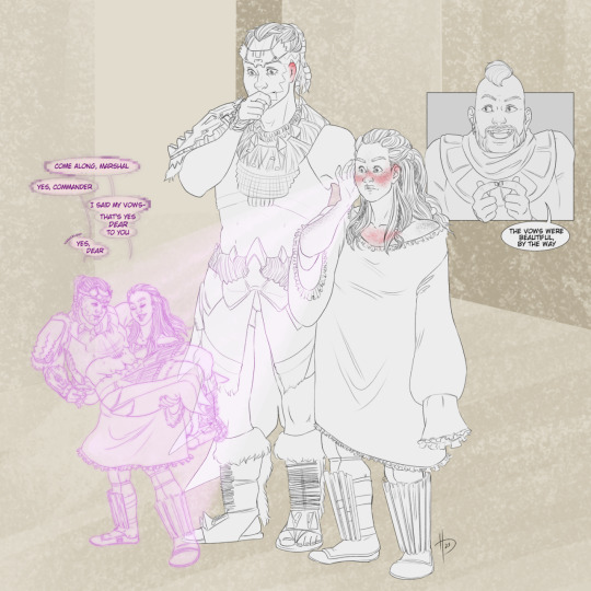
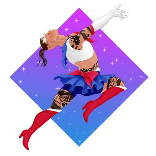
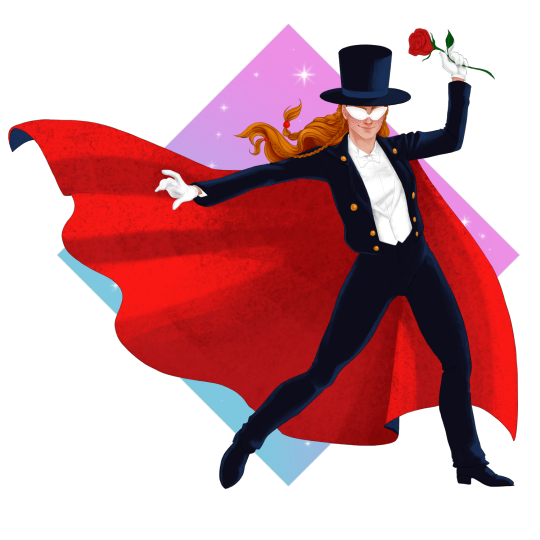
Q: What are some of your favorite tropes to write, draw, or read?
My old desire for enemies to lovers is strong, but this fandom has further kindled a love for subservient men who love their feral wives. I’m also very keen on accidental marriage and “oh no there’s one bed” tropes, but who isn’t >_>
To draw? I’m basically one big rubber arm, if you can make it appeal to me then I will draw it with gusto.
Q: What is an unexpected thing or fun fact about you?
I live in one of the HOT parts of Australia but I’m originally from the frigid Northern hemisphere in Scotland. Ironically though, I feel like it was my destiny to be Aussie. I love beaches (including the sand), hot weather and vegemite with all my heart.
Q: What has been your favorite thing about working on this project so far?
Honestly, I have really enjoyed working on the sprites for this game. My main inspiration here is the other incredible artists and writers in this fandom. I’ve never been part of such a kind and encouraging one before and while I can only speak for the Kotaloy crew, I have found a frankly staggering number of amazing people in the general fandom. Y’all keep me going, I swear.
#focus on the heart#foth#foth dating sim fangame#foth visual novel fangame#horizon forbidden west#meet the team: artists and writers#artist: pseu (picksleydust)#aloy x kotallo
30 notes
·
View notes
Text
Awhile ago, I found sprite rips of nearly the whole cast and NPCs in SMT IV (on Sprite Database). Since I had noticed that the sprites have different heights, and was so enamored by their attentive detail, I decided to make a little height chart for fun and for my own purposes. I even went a step further by slightly rotating bits so the sprites would be standing a little straighter and be slightly more accurate. This was what I had when I posted it (barring Flynn since he wasn't on the sprite sheet):

You'd think something like this would be pretty cut-and-dry. But at the time, I was messaged by someone who was actually bothered to see Jonathan taller than Walter. Their argument was that Jonathan's sprite has noticeably bigger proportions, as though appearing closer, and thus couldn't be an accurate representation of his height. And that since Walter is slouched, he would appear shorter than he really is (which I already did try to correct anyway).
Those are fair assessments and I noticed too that Jonathan's sprite is off compared to everyone else. I was told that I should downscale Jonathan a little to around Walter's shoulders, which I did. But to be perfectly honest -- and I mean this with respect to differing opinions and personal preference -- I wasn't too convinced by their argument and it actually bothered me being approached like that and told how the sprites should be. As though I had made the sprites. They're Atlus's own sprites.
And truthfully, that still bothers me even now. Everyone is of course entitled to their own personal preference and interpretations of characters -- I am hugely supportive of that. But it never sat well with me being told that Jonathan *has* to be shorter and that the game's own sprites were wrong, when I never even asked for their input. It actually left me feeling pressured to portray the characters a certain way in my work.
I don't believe that person actually meant any hostility and I'll ask to please don't bother anyone about this. However, as this did leave a negative impact on me, I would just like to break down my own observations and interpretations of the cast for my own sake.
First, I should add that the in-game sprites were probably not made from scratch, but are most likely downscaled versions of Masayuki Doi's artwork (with some minor edits to give them more natural poses). So of course, the first place to look would be Doi's own artwork.
A lot of this person's argument centered around the characters' proportions, particularly how even Doi's artwork has skewed proportions and are not accurate to scale. Their assertion was that Jonathan's artwork is disproportionately larger and that, when properly measured, he would actually be shorter than Walter.
So I looked into it myself. I took some incredibly high-res artwork of the Samurai -- these are likely press release assets and are the closest I can possibly get to having the unaltered originals. (You can find these on the Fandom MegaTen Wiki.) These are of equal resolution. I lined them up to compare:

(Pro tip: Paint.NET can open WebP files if you wanna compare these yourself. Or just use a site to convert them.)
I asked a couple other people to look at these with me. And we agreed: with all due respect to Doi as a professional artist, the proportions in the artwork ARE weird and (to my eyes at least) are not even equally proportionate to the characters themselves. Others have pointed out that Walter's upper half looks disproportionately smaller to his lower half, and I partly suspect that Jonathan's head is bigger than the rest of his body (even when considering the size of his hair).
Nonetheless, I tried my best to measure the artwork with the 8 heads rule. I even opted to measure a version where I tried to fix Walter's slouching. Granted, not perfectly.
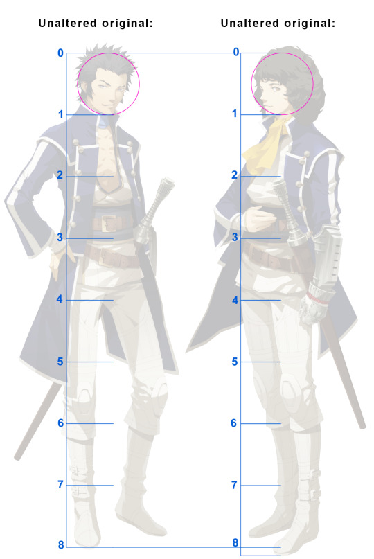
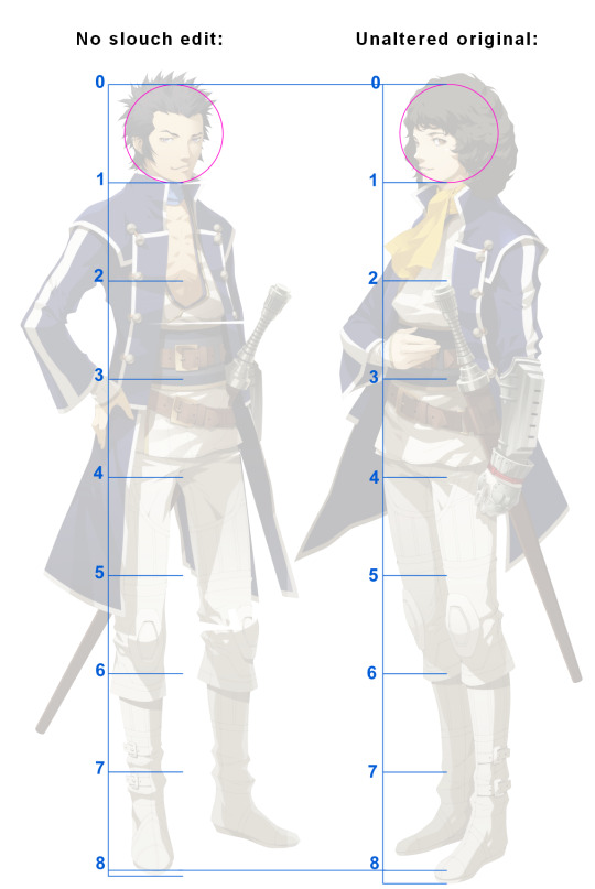
I will fully admit that my attempts at measuring are far from perfect and have issues, as can be seen by the uneven feet measurements (though I partly suspect that may be on Doi). I've also tried measuring these with fixed proportions and found those were even more uneven. If anyone else could take a better shot at this, go right ahead.
But if my measurements can be trusted, then it would appear that they are approximately of equal height. Or at the very least, there wouldn't be a very big difference. Walter could be a bit taller if he straightened up, but I honestly do not think he is slouching too terribly where the difference would be huge if he wasn't.
But also to be frank, these are awful images to measure from lmao. The 8 heads rule really only works for figures that are front or side facing and standing perfectly straight, neither of which applies to these. The angles, poses, and even the uniforms make these very difficult to properly measure and gauge. I honestly don't believe that the artwork are reliable to work with. As I and others have observed, Doi's proportions vary and the artwork may not even have been drawn to scale. This is not at all indicative of Doi being a "bad artist", especially when the proportions seem more purposely stylized for visual effect. I am sure I would find the same thing in Kaneko's own work as well. But aside from this being a good exercise in general art study, my take away from all this is that the artwork just cannot be relied on for a conclusive scale.
All that said, I'm honestly not too bothered by the measurements not working out. Because, when looking at everything else, it's actually clear to me that Atlus had very deliberate intentions in the portrayals of their characters.
As I mentioned earlier, the sprites are doubtlessly shrunken down versions of Doi's artwork. And the sprites actually have some really diverse heights when you look at and compare them all, like Kaga being so small and Skins and Infernal Akira being incredibly tall. Now yes, all of these suffer from the same issues as the artwork in that their proportions vary or their poses would be hard to measure -- but that isn't even the point. The point is that the sprites' heights still vary next to each other and are not all exactly the same. That convinces me that Atlus did take careful consideration in scaling the sprites and had specific intentions for how the cast should be depicted. They're not perfect, but these are hardly what I'd call careless or sloppy.

Yes it can still be argued that Jonathan's sprite proportions are off, because they are. But that doesn't mean that there is no merit to his sprite or that it is inaccurate to what Atlus *intended* for him. The fact they made his sprite as tall as it is tells me that this is the height they intended for him, irrespective of his proportions.
What of Walter then? I do think Atlus actually did take his slouching into account when scaling his sprite (they did for Navarre's sidequest sprite). In that case then, if he straightened up, he would still just be about equal height to Jonathan.
And if so, that would actually align with the game's illustrated cutscenes:
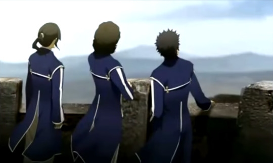
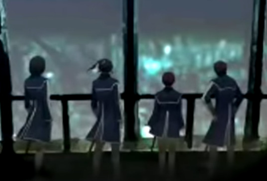
Walter's slouching is a lot more noticeable in the second image, but as already mentioned, I still don't think he'd be much taller than Jonathan or even Flynn if he wasn't.
Since it may as well be brought up, there is also the official side-by-side promotional image as well. This one isn't as good since everyone is in a vaguely triangle-like formation, but this gets thrown around a lot too in debates, so may as well include it for what it's worth.
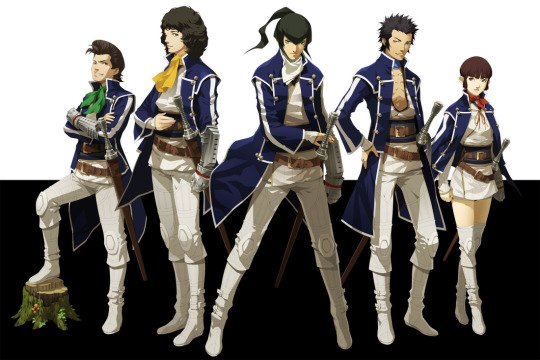
Now of course, it also needs to be said that Atlus aren't always consistent themselves and there's been instances of character heights varying in other media. Yet regardless, there is a recurring trend that can be observed in the sprites, the cutscenes, and the artwork if my measurements are at all accurate. As far as my own observations are concerned, Jonathan is either of equal height or just a little bit taller than Walter. And to be utterly frank -- I am much more inclined to believe the parent company's own portrayals over someone else's preference.
At the very end of all this, none of this really matters. Fans can portray a fictional character any way they want and there is nothing wrong with that. And -- unless Atlus were to release a book giving the cast's exact heights or were to make a full 3D remake that clearly shows this (both extremely unlikely) -- then who are we to really say what their heights truly are?
No, not even I. Despite my observations made here, I am not going to insist that any of this is true or canon, because I simply do not have the cast's exact canon heights in numbers lmao. This is not meant to tell people how they should portray Jonathan or Walter or anyone else, but merely my own observation. I am not going to tell people how they should portray, draw, or write them. Jonathan or Walter can be short, tall, or in the middle however anyone pleases in their own portrayal and headcanons. That is the beauty of fanworks and personal interpretation of a fictional work.
But just as much as I cannot tell someone they cannot have a short Jonathan, it is also equally not right for someone to tell me that I (or anyone else) cannot have a tall Jonathan. What bothered me about all this was not the person's own personal preference, which is theirs to own and I respect that. But the unsolicited insistence that Jonathan *must* be short, that this is canon, and positioning themselves as right while throwing shade on people who headcanon Jonathan as tall. I frankly found it all very arrogant.
Maybe I am no different by making this post though. But at least I have been able to express my *own* thoughts on the matter when I couldn't before, irrespective of what anyone thinks. Again I must stress to please don't go bother anyone about this. None of this really matters in the end and people are entitled to their own personal interpretation.
And if Atlus does come out and finally gives us canon heights for the cast, then I will happily accept that and be thrilled for new info about my favorite game. But until then or if ever, none of these characters have truly definitive heights and we simply cannot make that call. None of us are "right" or "wrong".
#again this is for my own sake in being able to express myself openly#shin megami tensei iv#smt4#megaten#rusty's prattles
25 notes
·
View notes
Text
Scratch in Scratch the Surface vs I Wanna Dance With Some-Ollie
[[[spoilers for season 2]]]
Long post sorry
I've been comparing these two episodes a lot, especially after the song Ghosts Aren't the Enemy from Book Marks the Sprite reminding me SO much of Lose-Lose from season 1. The conflicts are pretty similar, Molly has to keep someone from finding out about Scratch because of real and disastrous consequences, although instead of the flow of failed phantoms, this season it's the ghost chaser Chens. They aren't directly comparable since the contexts are different (Libby is a close friend and Ollie is a romantic interest) ((I'M SPEAKING CANONICALLY DON'T KILL ME SHIPPERS)) and the plot of Some-Ollie isn't really "hide Scratch" it's more focused on Molly and Ollie's relationship and how Scratch is reacting to it. Speaking of which:
Scratch's reaction to Molly's concerns about Libby is very dismissive. He doesn't really care about her and he's not super invested in Molly's personal problems either. The only times he's helped her out (at this point in the series) is when it personally affects him or he feels familiar pity for her. (First Day Frights and The Best Concert Ever are good examples of this) He's not completely won over by her antics yet. And while he is concerned for her wellbeing at this point, it's more like the sort of concern and worry you feel when you see somebody who's clearly not gonna be able to make the entire 5k run. Like you're worried but it's better if you just don't get involved. Baseline empathy, really

He does start cracking when Molly asks if she can tell Libby because she's misinterpreting the situation. Even during this, Molly doesn't break Scratch's trust and doesn't outright tell her without asking first. Knowing what we know about Scratch now, I think he's always had a soft spot for friendships and hates seeing them end, even subconsciously. He smiles as Molly runs away to catch up with Libby but he's still not happy about it. Yeah he warms up to Libby but telling anyone about him is a potential danger, especially if they feel the need to tell anyone else.
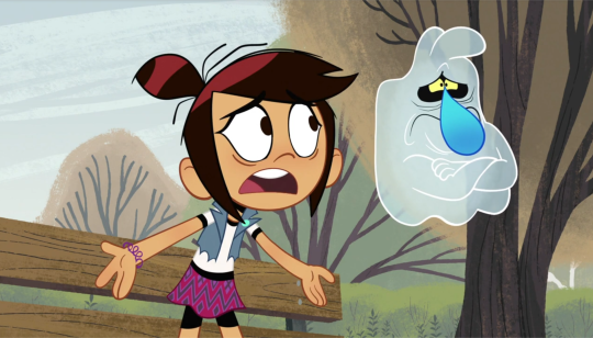
And in Friend-Off, he didn't really have a justifiable reason to be a jerk to Libby other than Molly's scavenger hunt they were both forced to do. Everything he said (both of them said really) was out of a place of pure jealousy. He even admits that at the end of the episode.
What's important to point out is this entire episode he's only thinking about himself (not an uncommon trend for this character) and is only willing to sacrifice when pushed to do so. Not saying he's necessarily written badly in this episode, far from it, but it is quite a contrast between that and his actions in the season 2 episode 5a segment I Wanna Dance With Some-Ollie.
I'd like to preface this with one of the scrapped titles for this ep was "Molly's Choice" and I think that will haunt me till I die that's such an evil title
I Wanna Dance With Some-Ollie is a VERY compelling episode. While the set up for it and Scratch the Surface is similar, this one feels like it has more stakes involved. Molly has a crush on Oliver Chen, a ghost hunter, and you can see how that could immediately cause issues. Scratch is even more dismissive towards Molly at points because of this, even colder and snappier than some of season 1a in my opinion. (For good reason obviously) and while Scratch's concerns here are mostly fear for his own safety, it's also jealousy. If he was so worried about Ollie catching him, he wouldn't be around him at all, let alone trying to sabotage the dance.
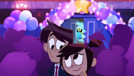
Molly doesn't take the threat the Chens pose very seriously and dismisses most of Scratch's concerns. (Not that she's a bad friend for this, she just thinks they're silly YouTubers and wants to enjoy a middle school dance) Scratch eventually blows up on her and they get into a rather brutal argument for an episode 5 of a DTVA show. It's presented in the usual silly way but they both say some rather insensitive things to each other in the heat of the moment.

We've NEVER seen them disagree this hard on anything. They've had differing opinions before but neither of them is budging on this one. They split off and you can see what Molly said to him hurt. She seemingly chose what was more important to her. He seemed to look back as if he was debating on going back in to apologize to her for what he said and did too because she just wants to have a good time and he was trying to ruin that. But he decides he's the last thing she needs right now and starts to go home, only to get caught in a spectral snare.
Here's the REALLY important part I need y'all to listen closely:
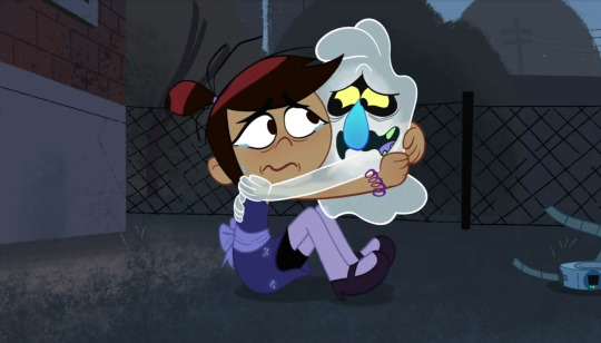
He had every right to an "I told you so". He had every right to tell her never to see Ollie again and to even consider moving just to save his metaphorical skin. But he doesn't. She apologizes first and he interjects with his own apology for trying to ruin her night. Her happiness is what's most important to him now. That priority shift happened since Out of House and Home, maybe arguably even sooner. He doesn't tell her never to see him again, in fact he IMPLIES that she should be able to do what she wants and he wouldn't interfere anymore. It was Molly's choice to cut it off with Ollie after seeing Scratch in that much danger.
He's still a self centered jerk with possessive tendencies and separation anxiety but it's important to point out that he recognizes Molly as her own person and he shouldn't interfere with her happiness. I think season 1a Scratch wouldn't have even LET her go to the dance with a ghost hunter as her co-chair to begin with. I know I don't need to defend Scratch's actions since most people are on his side in this episode (a weird change of pace) but I needed to get my thoughts out about him and his development so far. My boy has come so far, they feel like good, real friends. Also I'm just gonna reiterate Molly wasn't completely at fault here because she just wanted to enjoy the dance and both her and Scratch had equal fault in this scenario, that's called ✨good writing✨, you don't have to pick a side. THE WORLD ISN'T BLACK AND WHITE, OLLIE
I hope they address Scratch's jealous nature in a future episode, especially since they're hinting towards an Ollie redemption. After the ghost hunting fear is gone, that jealousy is gonna still be there, I'm kind of hoping after that talk outside of the school where Scratch resigned himself to whatever Molly wanted to do, he wouldn't be too jealous of him and we won't have a Friend-Off 2 or something. (Although if he decides to be a little petty and messes with Ollie a little, I welcome that. That sounds really funny honestly)
I feel like halfway through this I just started rambling, I hope my point made it across clearly LOL tldr; scratch is a well written character and he means so much to me and if I see any Molly/Ollie/Mollie slander on my account I will be throwing hands <3
#the ghost and molly mcgee#tgamm#tgamm spoilers#tgamm season 2#long reads#character analysis#scratch mcgee#and i care them so much#the besties ever#im so excited for this season#i think about 5a a lot if you cant tell#i have many thoughts and hate seeing this ep misrepresented#which i see often#thank you for reading
58 notes
·
View notes
Text
NUGGETS OF BENJAMAYO | aka just gif dump of my madness about 1 measly scene
✴︎
For Narcoctober's Day of Visuals - Oct 6th 5th (posted on the 6th cause I generally suck and my life is a mess) leftover from Day 1's fic
Okayokayokay so I made so many extra gifs for my Benjamayo fanfic that were theoretically set aside days ago for the Narcoctober Day of Visuals (I know that much like “fetch” Benjamayo is not a thing but much like the legendary Toaster Strudel heiress, Gretchen Weiners, I am very much trying to make it happen) and legit thought the prompt was Oct 6, not Oct 5 but I already have an amnesty day post technically I haven’t gone to sleep yet …? So technically yesterday is still today regardless of the date...? and I can’t not share these bc LET ME DO TELL YOU, I'VE THOUGHT ABOUT THIS INTERACTION FOR LITERAL YEARS NOW so without furtherado
The scene in question: Benjamin schmoozing at Dina’s wedding, shaking babies and kissing hands, spots Mayo and decides, fuck it- he’s in a good mood! Little social butterfly, precioso is feelin’ himself. It’s a wedding, love is in the air! Why not take a moment to go flirt chat with Mazatlan’s very own Camarón King of actual sex Not Giving A Fuck About Anything Pretty Much Ever, Ismael El Mayo Zambada and this is how it starts off. First, Mayo asks the waiter?/waitress? if the shrimp in the shrimp cocktail is fresh but manages to pose it in the most sexy way, it’s actually borderline disturbing just how fucking hot this man is asking about fucking shrimp of all fucking things then again, passion in one’s professional pursuits is pretty hot …? But like no, I really don’t think that’s what’s happening here

Then Mín, little pep in his step, La Reina del Baile, glowing even more than the bride herself, strolls up and basically is like, “Bish, that’s a spiffy new hat. You buy that with the money you made movin’ shit through my plaza? cause there’s more where that came from if you’re interested in a sugar daddy🤭”
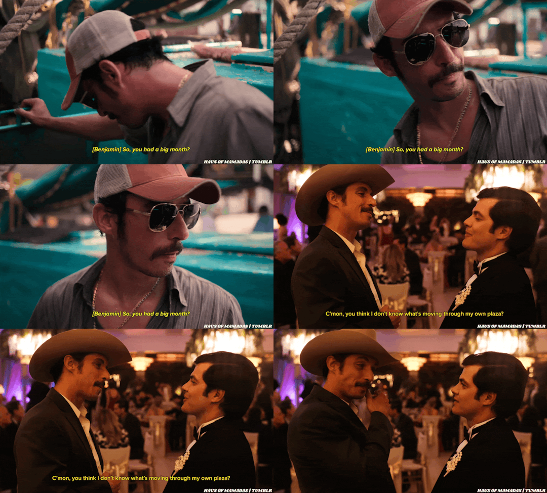
At which point Mayo is lowkey like🫣 oh god, what do I say now. Is he trying to strong arm me, what’s the angle. I really don’t wanna start shit rn, I’m so full of shrimp, like ngl I don’t even think I could run away without making myself sick and he tries to keep things simpatico but like the extra mile he goes??? This sly mf is smiling at Mín in a way that resembles a little too closely how he smiled at the waiter/waitress. And sure, maybe we can chalk that up to just Mayo a ho. He a May-ho sry, I just– you know I set myself up to spike that ball and I couldn’t not no matter how bad it was sksksksks and Mín rolls with it, he does one of those blind-and-miss-it thousand yard stares which I will devote an entire gif set post to later bc he does it more than once throughout the show and it’s actually devastating and shoots his shot, “pero imagínate que no tuvieras qué”


So anyway, this establishes what? Mayo a May-ho, right. And Mín is lowkey liiiiiiiiiiiiving for this shit bc he thinks he’s got an in. And do you know what tf this savvy, spritely little Drug Lord Dilf-Nymph of Tijuana does????????? something Miguel would never dream of doing in a million years, not just bc he’s homophobic asf and deeply insecure about his entire general essence as a human being, but he doesn’t have a fucking f r a c t i o n of the affable, boyish charm that Mín does HE FUCKING FLIRTS RIGHT BACK. TAKE ONE GOOD GOTDAMN LOOK AT THE GIFS BELOW AND TELL ME HES NOT FLIRTING. YOU DONT FULL-BODY SCAN SOMEONE UP AND DOWN LIKE THEYRE THE FUCKING THANKSGIVING TURKEY AND YOU HAVENT EATEN IN DAYS UNLESS YOU’RE SEXING THEM IN YOUR MINDDKSSKSJWB I MEAMaaaan–
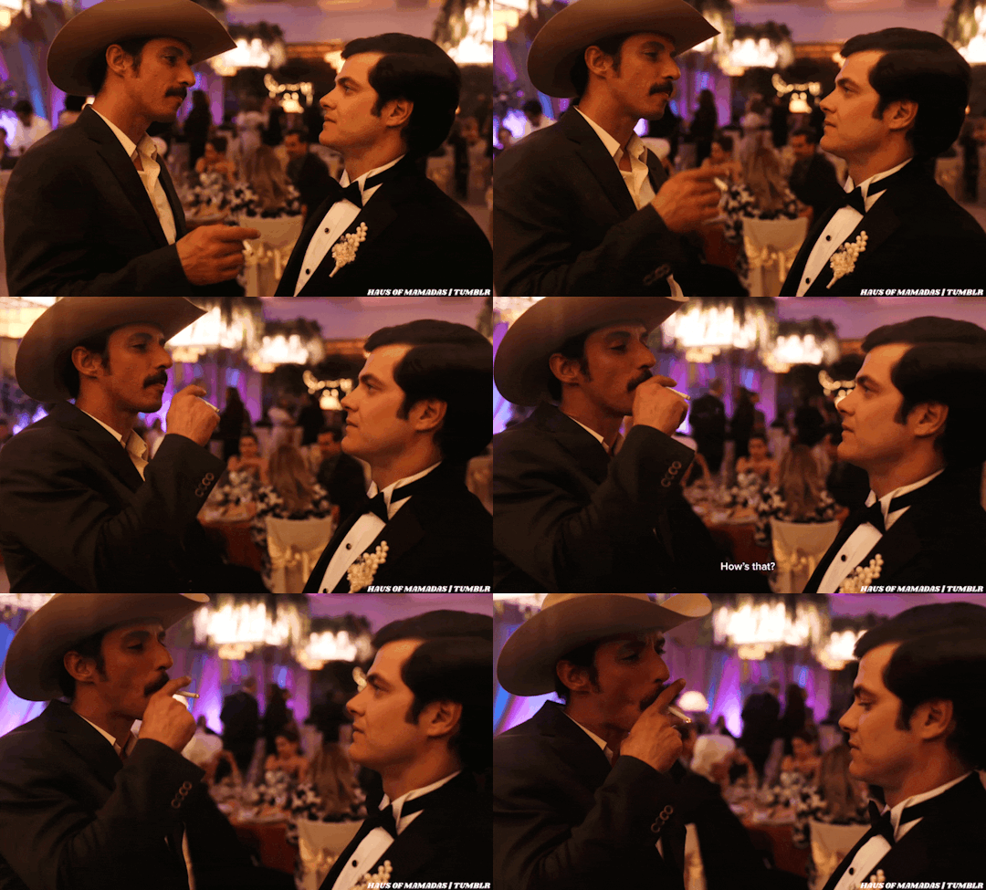
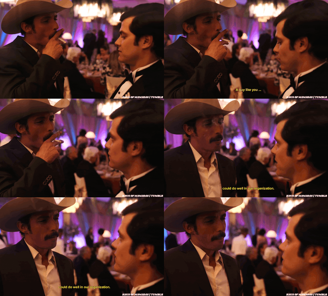
BUT DSKWJWJWIEIWJWJSB THE BEST FUCKING PART ABOUT THIS ENTIRE THING?????????? MAYO IS SO DOWN FOR IT. THE SHIT-EATING GRIN HE GETS ON HIS FACE LIKE MANS IS SO GODDAMN FLATTERED, MANS IS SO ABOUT IT, HES LITERALLY THAT GIRL DAFFYDUCK GIF, ALL BATTING HIS EYELASHES AND UNDRESSING SEDUCTIVELY, OKAY LIKE
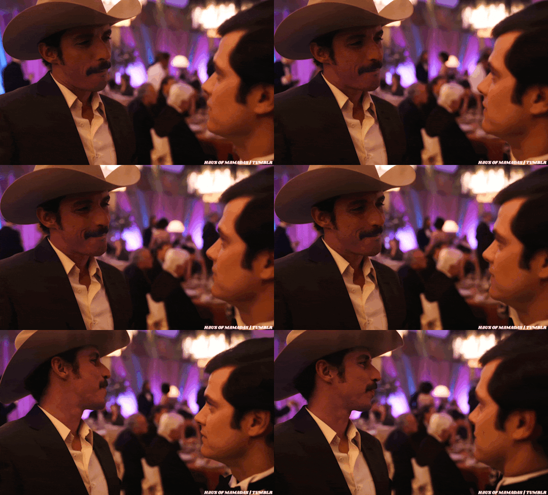
WHERE IS THE LIE Spoiler alert: IT’S NOWHERE, THERE IS ONLY TRUTH OKAY and then Mayo does this real cute thing all appealing to the control freak in Mín, saying he likes to be his own boss, “no más que tú sabes” and all that AND THEN, AAAAAAND THEEEEEENNNNNNN FOLKS HE JUST. KEEPS. ON. MF. GRINNING. AS IF HE COULD GRAB MIN BY THE TINY LAPELS OF HIS TINY SUIT AND PLANT A BIG WET ONE RIGHT THERE ON HIM, RIGHT ON THE DANCEFLOOR IN FROMT OF ALL THOSE PEOPLELWKWJW W
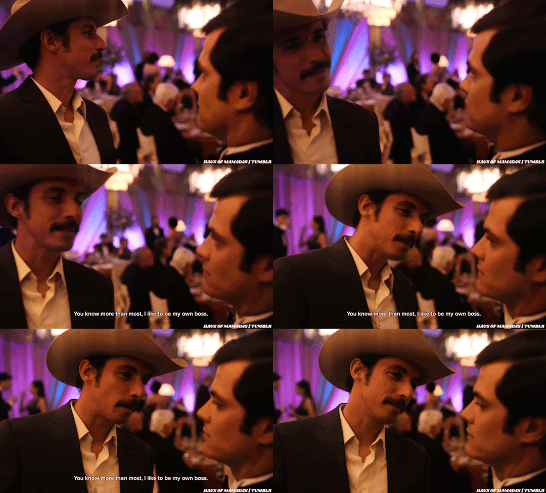
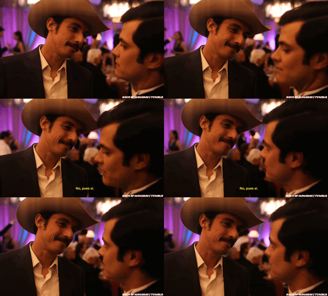
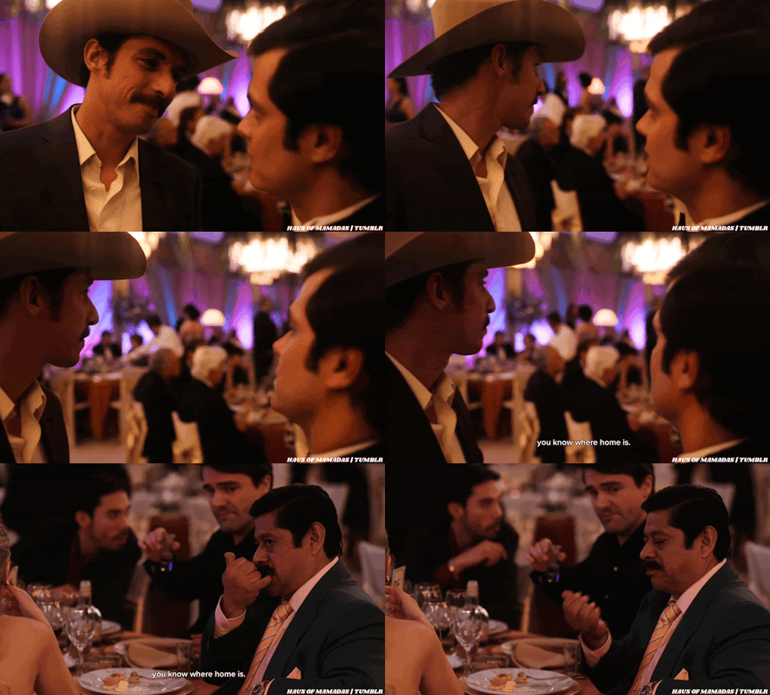
and then he has to scramble for something else to say bc he knows good goddamn well that they've been making eyes at each other for far, far too long, so he's like "ohshitohshitohshit ohhhhh look there's Azul, the closest boner killer within reach besides Rayo hey, you know where home is!!!!!" AND THEN MIN, FUCJINGAKSJFNLKQJWELKJN DOES THIS WAY-TOO-INTIMATE HEAD NOD AND SMIRK, THANK YOU VERY MUCH FOR COMING TO MY PARTY ERM IMEAN DINA'S WEDDING, IF YOU'RE EVER IN TOWN GIRL CALL ME

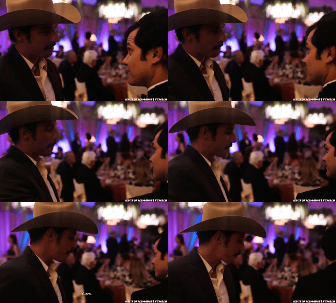
NO BUT EVERYONE LITERALLY SHUT UP AND SITDOWN ALL FIVE OF YOU BCTTHENNNNSI;RAJQPO23IJRPOQJIWEFOH THE WAY MAYO SAYS CLARO, AND IT'S THE EXACT WAY I WOULD IMAGINE LIKE HOW HE'D GOODBYE LOVE PAT A ONE NIGHT STAND ON THE SHOULDER AS HE'S OPENING HIS FRONT DOOR FOR THEM TO LEAVE ???????? IDK IDKIDKIDKDA;WOJEF;AOIJ AND THEN THE LITTLE PRIVATE LOOK OF LIKE "idk what the fuck that was but I'm- y'know i really didn't hate it......"
it just- i mean i'm sure we're all in agreement that i'm insane but like what other conclusions am i supposed to draw in the face of this raw, objective evidence
☇
taglist: @narcosfandomdiscord, @narcolini, @ashlingnarcos, @drabbles-mc
#narcoctober#day of visuals#but like .... a day late#bc i'm the worst and don't know what day it is at any given moment#imsorryforeverything#narcos mexico#benjamayo#it's not a thing but we can pretend#day 5#oct 5#gif dump#og gifs
13 notes
·
View notes
Text
Working on Magical Friends: Doki’s animation “pipeline”
…Since this is still an incredibly basic 1.5-man operation, it’s not much of a pipeline. ^^; But I wanted to put together a little thing to show the public how I do what I do, and if this sounds doable or interesting to you, I’m always on the lookout for more volunteers! [email protected] is my official ‘art business’ email, just FYI~
So let’s start by taking a look at this GIF preview of a finished scene:

I chose this sequence because it’s probably the longest and most complex one I’ve done so far. The character rotates, the scene pans up, I got some spinny light effects in there, lots of weird stuff I’ve never done before. (●u●;;) But it came out alright in the end, so let’s examine it.
So before I start thinking about animating, I refer to the work of my storyboard volunteer, Greytan. They actually gave me just one simple shot:
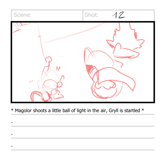
Which I extrapolated into…what I did. ^^; I don’t mean to ‘ignore’ their boards, and I hope they don’t feel slighted when I do things like this, it’s just that they are genuinely a much more skilled and more professional animator than I am, and our brains just don’t work the same way so sometimes I have to diverge a bit. :P Or, y’know, sometimes I come up with a great idea of my own that I really wanna try, which is probably what happened here.
Anyway, my first step after looking at boards is to grab a pencil and paper and draw the shot: a picture that lays out what the scene will look like, with either the starting frame or a key frame, and the background included. As you can see, I doodled some of my ideas for how the sequence would progress, which is good, because after drawing this I wouldn’t return to this shot for like 6 weeks. ^^;
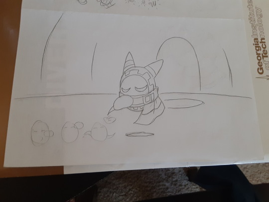
When I finally did get back to it, I grabbed a second piece of paper for Step 2, which is the actual ‘animation’: using the shot as a base to draw the rest of the frames that will go into the sequence. This is where my lightbox comes in handy, although usually I can see through the paper well enough to just draw wherever. ^^ [Fun fact: in my early days, I would just scan the original shot, erase it, and replace it with the next frame, drawing each new frame on the exact same piece of paper. I am…very glad I don’t do this anymore]
Now, animation is mostly guesswork for me. ^^ I mean, my guesses are pretty good, but they’re still guesses, which is why I call myself an amateur. It’s not me downplaying my skills, it’s just me admitting that they aren’t based on solid expertise or experience (yet).
When I animate a shot, I try to make sure each frame looks like it has movement in it all by itself. Gesture drawing, dynamic posing; those are things I’m already good at, so when I animate I make ‘em work hard for me. >:3c
The end result comes out looking kind of like a sprite sheet:
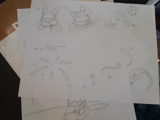
And I do use these drawings kind of like assets; Step 3 is to scan them (along with the initial shot) and use them to ‘construct’ the frames that go into the video editor. This is the step that takes the longest, where I clean up the sketches and color them and paint the backgrounds (separately, if necessary). It’s not as difficult as Steps 1 and 2, but it’s a lot more tedious.
So naturally, sometimes I like to make sure my sprites actually work before I start all that…work. ^^ So I throw together a test animation based on what I have:
And this did help-- it assured me that the first half with Mago would probably look fine, although the second half with the magic light-thing probably needed to have a cleaner sense of direction and more frantic movement as it ascended. When you’re working with a low frame-rate, you generally want things to move a LOT or hardly at all; you don’t want any of that in-between stuff. So I took that into account when preparing the “finished” product. I put “finished” in quotes because I’ll probably adjust the timing of the frames a little when I move to the video editor (Step 4, which I’m not going to talk about here). But yeah, that’s pretty much it. ^^
Generally when I think about adding artists to the team, I’m thinking about them doing Step 1, Step 2, Steps 1 and 2, or Steps 1-3 (so basically, completing a full sequence of frames that I can just add in). For me to hand sketches to someone and expect them to do Step 3 alone would require a level of trust that I’ve never had in any fellow artist before…but idk, anything can happen in the future. ^^;
#if you like any of my strategies feel free to gank them for your own projects#knowledge is power#kirby#animation#magical friends wip
45 notes
·
View notes
Text
thinking more about the character assets I’m planning on making in the future… Wondering how many characters i should include per pack, and what exactly should be in each pack.
I was initially thinking each character be released solo, but that’d be way too much. Now i’m thinking somewhere between 4-8 characters per pack. I was already gonna solely make packs for characters I deemed NPCs, but a little while back I decided yeah, the “adventurers” should come in packs too for sure.
For the content; 1 halfbody with multiple expressions (+ faceset versions) and a 4-directional, 3-frame walk sprite per character is the bare minimum. And this is probably the most any NPCs will have.
Beyond that, I could possibly have a second halfbody with its own expressions. And a static battler (enemy sprite) compatible for frontview, sideview, or both?
And then there’s the question of animated sideview battlers… Would it be too much on the workload & hold back the asset release time significantly to make these?
Sideview battle systems are very popular in mv/mz in particular with the reintroduction of animated sideview characters by default (plus the character generator). That’d been gone since 2k3. Having animated sideview battlers (gonna call them ASB now) of these characters I make WOULD get more interest on average… But I wouldn’t want my characters to use the base model of rmmv/mz.
As an RM dev who plays a lot of RM games, i’ve definitely seen a lottt of these sideview sprites in particular. I absolutely don’t think less of any games that have them, though. Just… I’ve seen that same default “bobbing with arms at side” idle animation so much its in my dreams i swear on my timbs.
Anyway, I’d want to make my own style of ASB’s if I did include them in these packs. It’d probably be just about the size of the MV/MZ ASB sprites. Mine’d definitely need to be a style that has its own base model as well, or else i’d be taking even LONGER per character. …But I’d want the characters to have their own unique poses in some instances (like victory pose).
Slightly off topic, but monsters have been a lot easier to figure out. They’ll have static battlers, but i’m planning a Final Fantasy Mystic Quest kinda thing where they have different poses depending on their state. Whether that’s states of damage like FFMQ, or “idle, attack, defend, and KO” poses, I’m not sure yet. Monster packs will be bigger than character/NPC packs for sure though. At least 10 different monsters per pack.
…
…And well thats about all i got to say lmao. Mainly just rambling and thinking, you know how it is. But also please lemme know any thoughts and opinions you have about this. And questions, definitely send questions if you have any.
#i feel like i need a tag for this…?#talking assets#rpg maker#technically not just rpg maker but clearly i have a focus there#i love rambling gotta be one of my favorite things#i will say that if i made ASBs the bases would defintely be released for free
6 notes
·
View notes
Text
status report production wise...
so, about the latest update. you may have noticed i've been able to put out two updates in a single week, which is insane considering the short amount of time i've got to work on these, but a big help has been my recent decision to switch to a much quicker and more consistent method of updates.
you see, the stray star went through a few revisions on what type of media its updates would mainly consist of. first it was going to be mostly fully animated video game cutscene-esque videos with original music and sound effects. then, it was scaled down to special occasions for videos, but fully colored and self contained comic issues for each update.
finally, we have reached the current compromise, which is a few exceptions made to make fully animated videos when it might seem cool to do so, as well as some other types of media once in a while, but mostly sprite comics.
there are a few reasons for this, the first being as you can see being that it gets the job done much quicker. i can simply draw up a static background, get a few character sprites done for each fitting pose and expression, and set that bad boy rolling with the dialogue necessary.
the stray star is a big, BIG story, and i know it may not look it at the moment, but if i'm going to tell this whole story before i, oh, i don't know, end up doing this for like four years, i need to cut down on how much time it costs me to get these going. i want to at LEAST have arc 1 finished by the start of next year, and that's already a big ask.
but with this format of updates, things get significantly easier. therefore, you may see comics popping up significantly less. as for animated videos, there are some in store, but again, they will only show up when fitting.
that being said, one of such situations is the next video! i have the music ready for it and i'd hate to see that funky little baby go to waste. it's quite different from the demo i put up here a few weeks ago, so i wonder if people will get pleasantly surprised from hearing the newer version :3 i sure hope so!
so that's going to take a little longer. drawing all the sprites, looping animations, effects, arranging the video, all of that requires a lot of time to get going, so i'll do my best to work on that and get it to you as early as possible! we will see how long this takes...
there is one more thing before i wrap up this update. i think if you frequent the site enough you may or may not have noticed tumblr is kind of. uh. going through a rough patch. i'm currently hatching a plan to, if possible, move the stray star to its own neocities domain, however i have never made such a website before, and i'm famously bad at coding (believe me, if i could make tss a video game, i would, but i really and truly suck shit at this, plus it would require a lot more asset building than i already am doing). i have heard there are some ways to set up domains easily via using handy assets to set up a premade code n then customize, so i'll try that this weekend... and we shall see.
all this to say, as i work on the next update which will take longer because of its complexity, expect me to also try and set up a website for tss. i probably won't shut down this blog and will keep updating on it and will keep it up as an archive even if i decide to stop using tumblr, but if i can help it, i'll try to move most of tss there and spruce it up as a definitive gateway for the project.
well, that's it, see you all next update! (or status report... we will see)
4 notes
·
View notes
Text
hiya! so those of you following me may have noticed that touhou has taken over my brain over the last summer. i’ve been working my way through playing all* of the main touhou titles and after finishing th11 realized that i have many thoughts about these games and no real outlet because none of my friends play touhou so im just gonna start doing these review-esque posts about all the touhou games once ive finished them. as you can tell by the fact i just beat 11 i have a bit of a backlog here so expect to see a handful of these.
if you do not care about all that, thats fine. i just really wanna talk about touhou lol. posts in this series will be tagged “#grimoire of nina” for archival/organiztion purposes. anyways all that said it is time for the actual post
nina’s thoughts on Touhou 6 - Embodiment of Scarlet Devil
it's the first touhou! well it's not obviously there's a big 6 there but it's the first in the windows continuity, the first that ive played through to the end and finished, and supposedly the first in the streamlined danmaku style of gameplay.
since its the first of them, its lacking in many unique elements that make it easy to talk about, so this one's probably gonna flow way worse than later reviews. it's very simple but not in a bad way, just raw shootin’ and danmaku dodgin’. one interesting “mechanic” unique to this game is ironically it's lack of one. in touhou to make dodging the bullets possible your actual hitbox is way smaller than your character sprite, and later games let you view your true hitbox while focusing. EoSD doesn't have that, so you kinda just have to get a feel for what parts of you can safely take a shot without you getting owned. it's kinda fun not knowing exactly whats safe, but probably rough if you’re used to the later games. of the different player options my favourite was Marisa’s illusion laser setup (i am not immune to master spark) but all 4 choices were pretty fun, and i ended up doing 1cc’s with both of Marisa’s options.
the characters in this one are all really good! it helps a lot that most of them show up frequently in future games and outside media and get more development. if i had to pick favourites though, id go with Rumia, Patchouli, and Koakuma. Rumia is a adorable little gremlin youkai with darkness powers who flies around t-posing, using darkness to create an orb around her during daytime to block sunlight and subsequently bumping into trees cause she can't see anything through the orb lmao. Patchouli is a tired magician youkai who spends all day in a huge magical library reading tomes and being bothered by Marisa. she has like asthma and anemia so she can't do any physical activity ever she's just the ultimate nerd. also her everyday outfit is just some comfy purple pajamas its an absolute vibe. lastly Koakuma is Patchouli’s familiar who's a summoned demon of some kind (usually interpreted as a succubus) who has the unfortunate job of actually managing and organizing the insane labyrinthine library that they live in and assisting Patchouli with personal matters. ironically Rumia and Koakuma have like the least characterization actually in the game (along with Daiyousei) but they get more love in external media and fanon.
overall EoSD is great. it has a set of beloved characters, and really solid base gameplay. its a bit basic and lacking in a few features but its still great fun :> thanks for reading if you actually stuck with it this far!
(*not sure if i will play the first 5 games from the pc-98 era. i may check them out afterwards but theyre not high priority)
6 notes
·
View notes
Note
between you me and those two lalafall t posing that azure dragoon in submission in the corner there what is your favorite part about screenshoting writing or otherwise producing content for your character?
Buckle up cuz I've been rotating this concept in general for a while!
Okay, back in college (I still feel weird saying that) I lent a friend my notebook cuz he missed a lecture one time. He noted that I doodled all over them, and asked why I did so. My answer was something along the lines that I was going to burst if I didn't.
And it's still true for me to this day. I have to write or draw or do gpose/screenshots cuz otherwise I'm going to explode. An idea comes to me and stares me and compels me to execute it. Hell, when I get a good shitpost idea, it feels like my third eye snaps wide open and I cannot get any rest until I make some sort of token effort to try and make it real in some fashion.
As for a favorite part? I don't know! The Defunctland tweet about film making being the worst thing other than not making films is pretty accurate on occasion. I mean, I do enjoy the fruits of my labor. I was scrolling through my own blog smiling at the stuff I've made before I started writing this answer. But depending on the creation, creating the thing is more important to me than having the created thing.
Like this essay of an answer! Not only do I feel obligated to answer you, but I have to admit that writing this is going to be more satisfying to me than coming back to it later and reading it. And that's been true for most of my life. I remember goofing off with spriting at a young age and just enjoying editing the visual of Pokemon trainers without worrying about posting them for a while. It's just been this last year and like, high school that I would get consistent feedback on my creative endeavors. College and working at my last job didn't leave me with enough energy to do creative stuff and present it in a viewable fashion. So that leaves me wrapping my head around the idea that I am having positive human interactions because of my blorbos and blorbo related content.
As for Rowan being the central character of this content? She's more or less the character I've always made creative content for. Whether it be in a Night Elf form or original Elf form or Elezen form, she's just been the vessel for any creative endeavors that need a person-shaped avatar to fill. Now I can confidently say that Rowan is probably distinct from her predecessors by virtue of being worked on so much more lately, but she's just drawn from the same primordial muse ooze that I've always been drawing from.
I think I hit all the points I've wanted to here. Well, the peer-reviewed, undiagnosed ADHD is probably a big contributing factor as to why I feel like I'll burst as a way to combat boredom (and for how this reads lmao).
But, uh, yeah. Thanks for the ask, anon. I hope it wasn't far more than you bargained for XD
#rayn speaks of herself#and of creativity i guess#rayn back at it again with the essays#yeah i am still trying to wrap my head around being somewhat popular in this little niche of mine#i am enjoying the feedback but i would still create regardless of human interaction#cuz i would probably literally explode otherwise
5 notes
·
View notes
Note
5, 8, 15?? :]
5 — anything i havent drawn yet but want to
oh theres a Number of things, i constantly have about 4 or 5 ideas in my head at any given point. in a general 'never drawn before but wanna' sense i wanna try and do a landscape painting one day or something but in a specific sense i wanna get started making sprites for my next carrd scene
8 — what do i like most about my own work
already answered this once so ill say smth else i lile about it, i think im pretty decent at posing most times! the anatomy is usually a little funky but im pretty good at keeping my subjects in character :-)
15 — biggest artist pet peeve
its pretty typical but when i fully finish something and think its ready to post only to realize theres. a massive glaring mistake . that would be a massive pain to fix </3 also community wise i hate when people go after artists for not having an 'appealing' style or whatever, its just really stupid and mean imo
2 notes
·
View notes